

Filter the dashboard
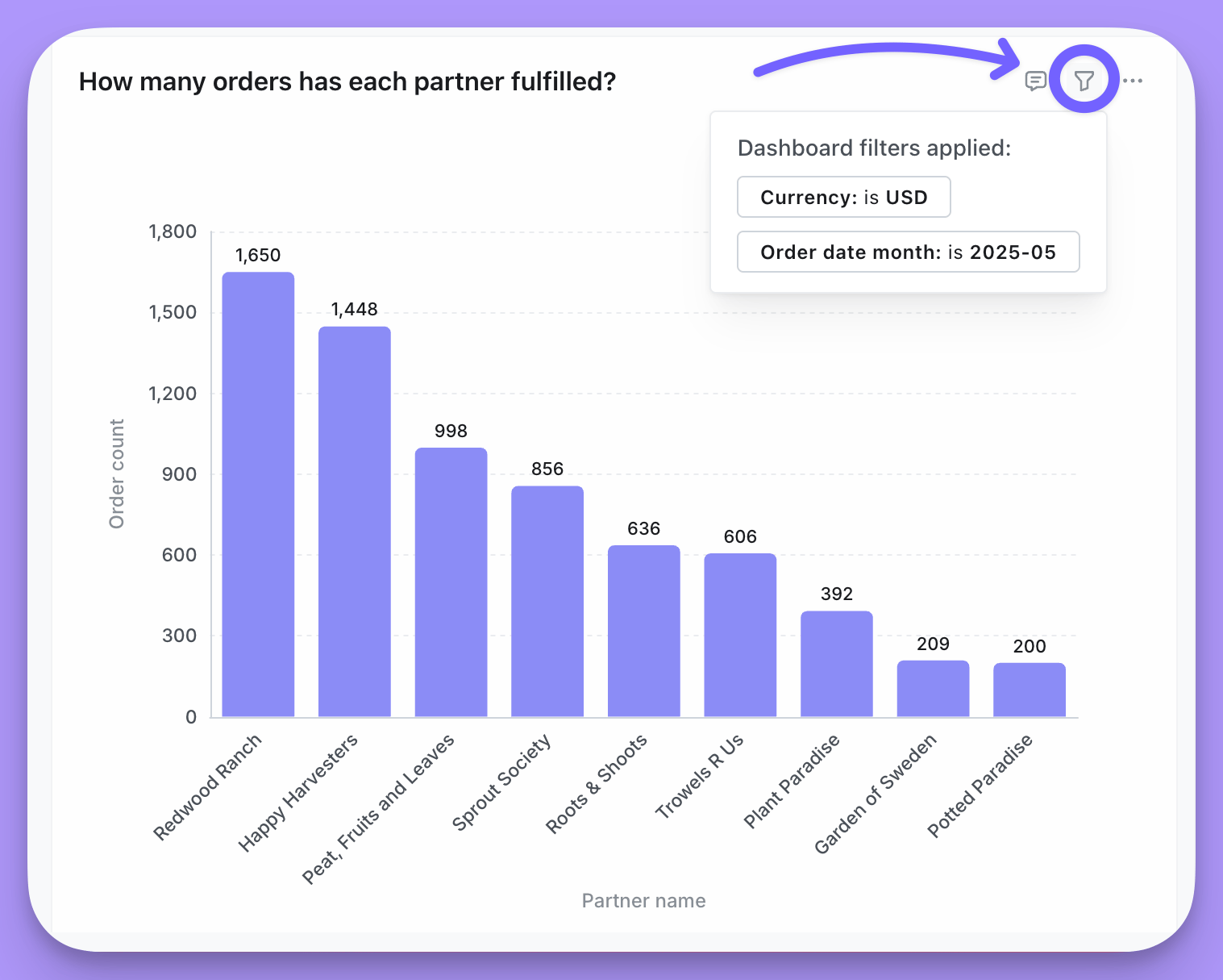
Filters sit at the top of a dashboard and change the data in the tiles below. Click a filter to change its value, or clickAdd filter to add your own — the filters you add yourself are temporary, so nobody else’s view changes.
Editors can save filters into the dashboard, require viewers to pick a value before anything loads, and control which tiles each filter reaches. See dashboard filters for all of it.
Change the date granularity
Date zoom changes the granularity of time-based charts — Day, Week, Month, and so on — without editing them. Editors set up controls that govern every chart at once, or just a chosen subset.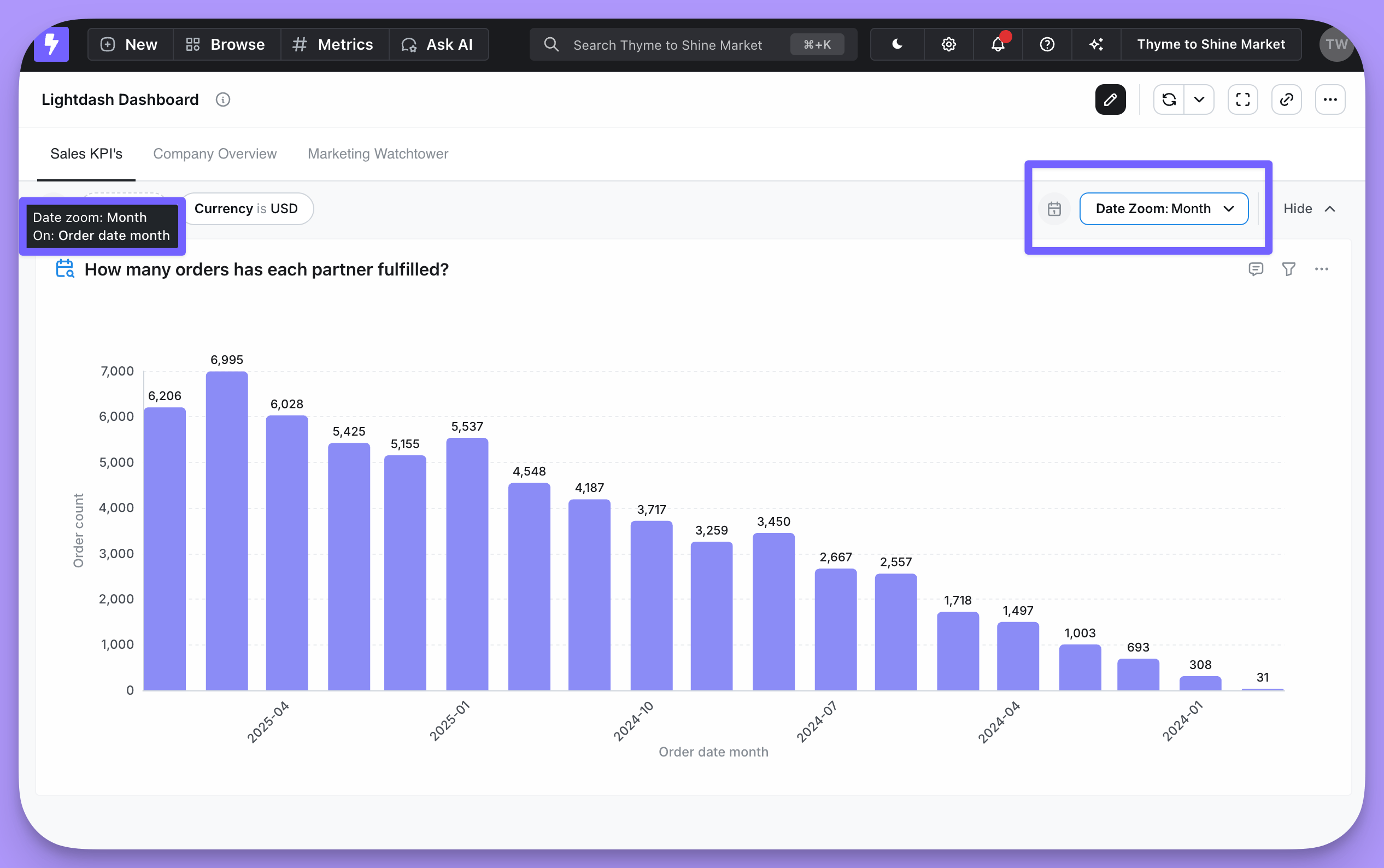
Cross-filtering from a chart
Clicking a value in a chart — a bar in a bar chart, say — lets you filter on that value and update every other relevant chart in the dashboard. Filtering a dashboard from one of its own charts is called cross-filtering.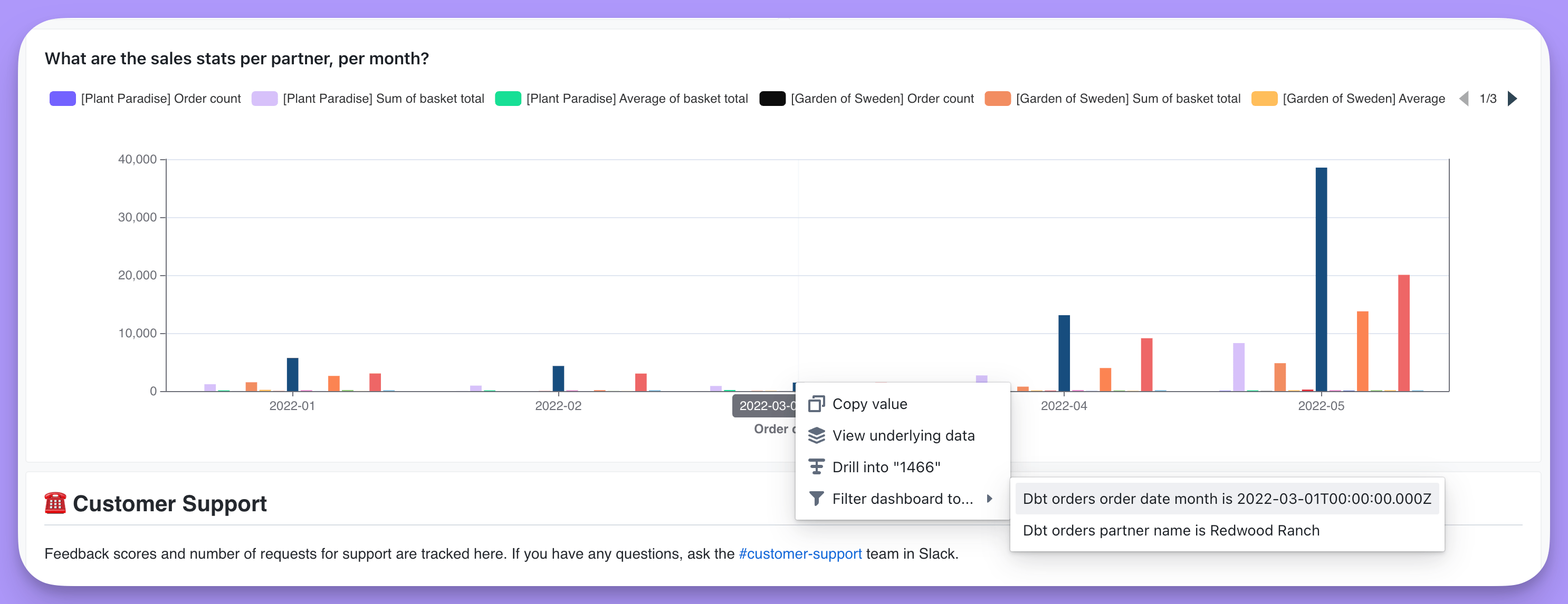
View underlying data
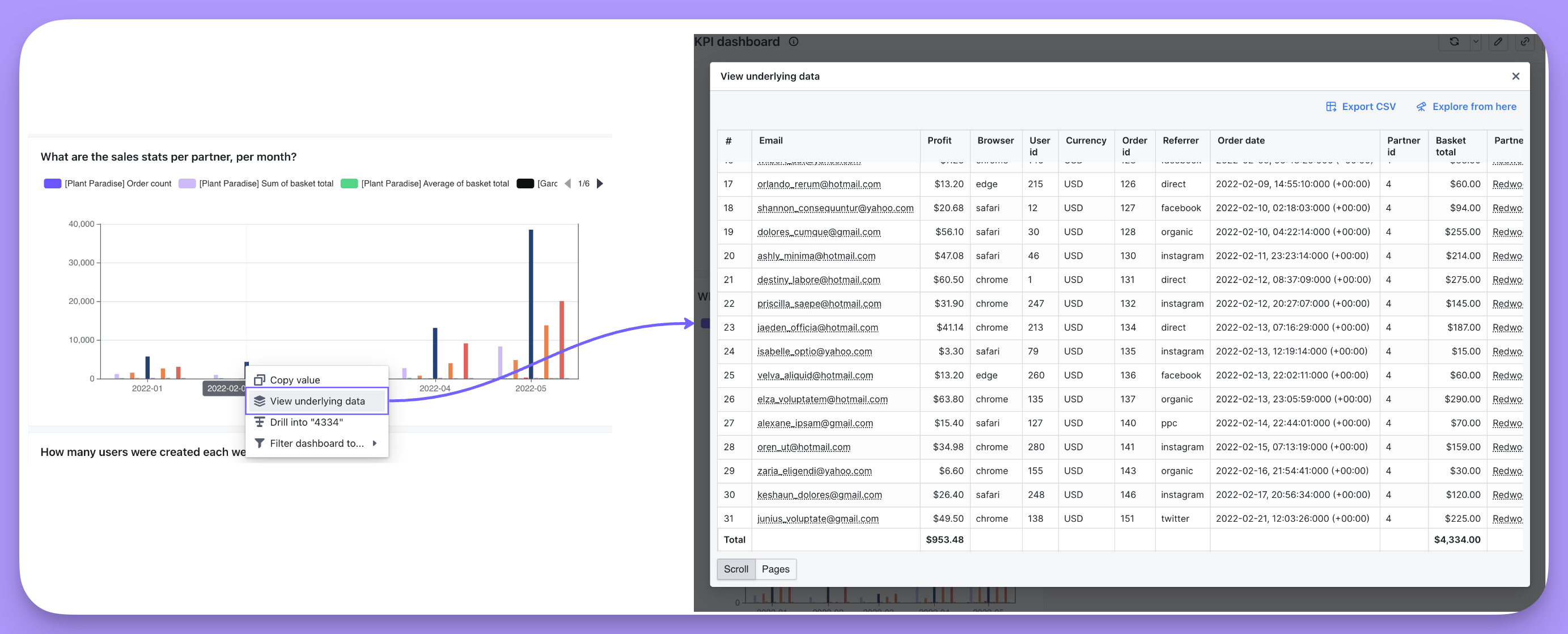
Click any point on a chart or any cell in a results table and pick View underlying data in the action menu to see the records that make up that number. For example, clicking the bar for a month in aSales stats per partner, per month chart shows every row in the underlying table that adds up to that month’s total.
Choosing which fields appear
By default, underlying data shows every dimension from the table, plus every field from any joined table included in your results. To show a narrower set instead, specify the fields on the metric in your table’s.yml file — see show underlying values in the metrics reference.
Those same fields are pre-selected when someone clicks Explore from here from the underlying data table, so they don’t land in an empty results table.
Drill into a metric
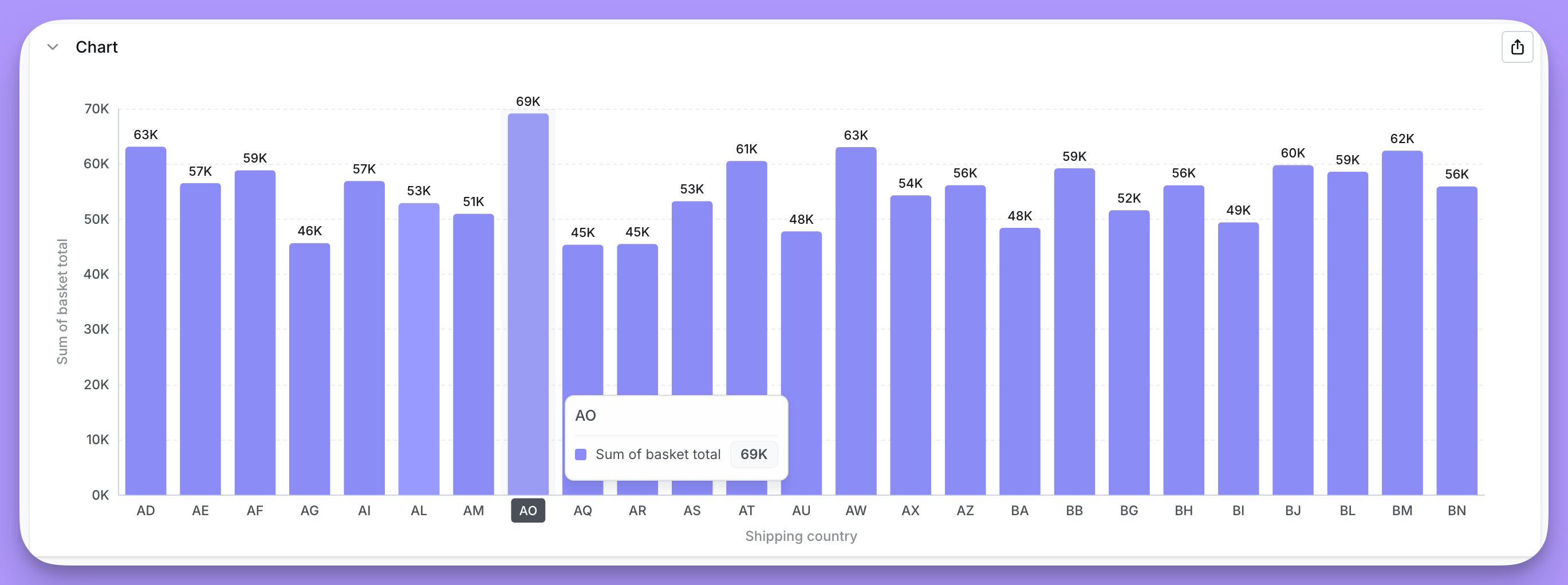
Drilling breaks a metric out by a dimension — total revenue segmented by product type, for example — so you can see where a number came from. Drill into works on metrics only, not on dimensions or table calculations. Take a chart of Sum of basket total per partner, per month, with a conspicuous spike in sales for one partner in May. To find out why, click the data point and then click Drill into in the action menu.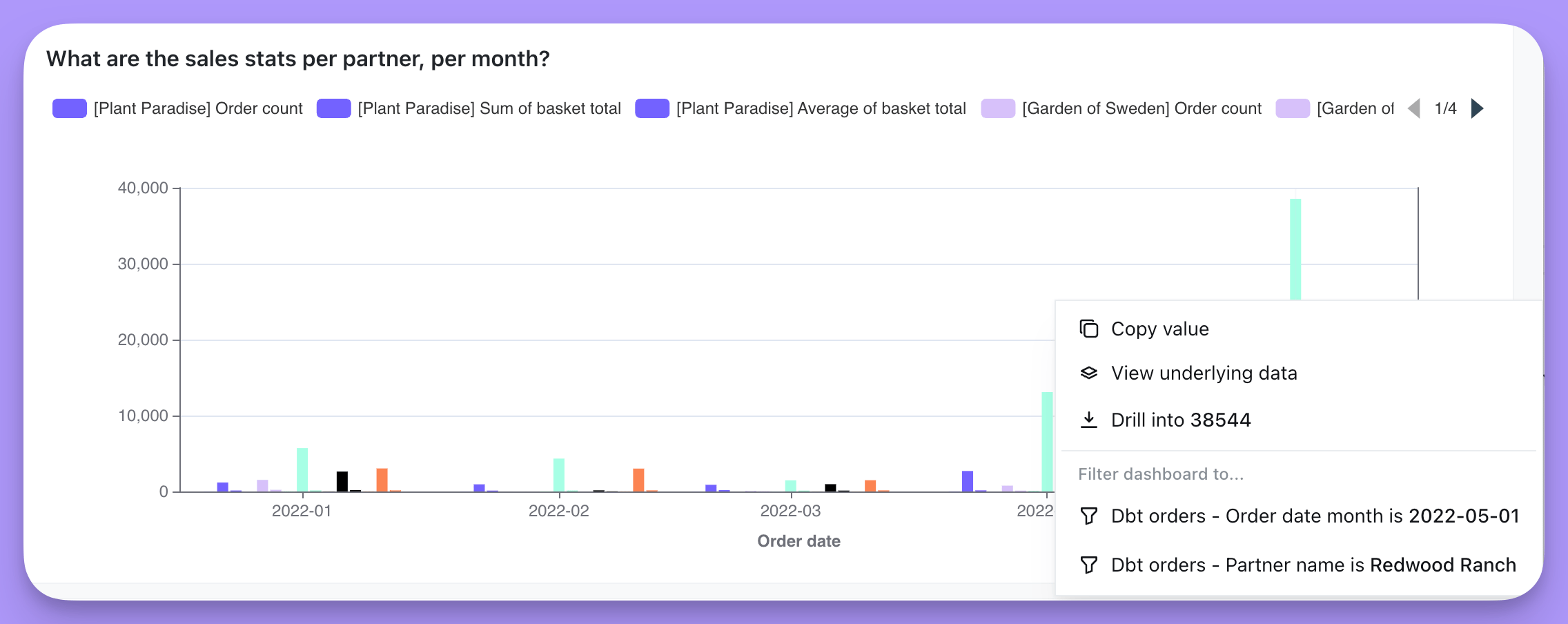
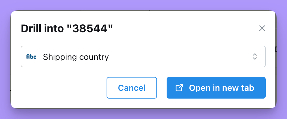
Shipping country, which shows where the spike came from.
Comment on a tile
Every chart, markdown, Loom, and data app tile carries its own comment thread. Hover over a tile and click the speech-bubble icon in its header to open the comments panel — on tiles that already have comments, the icon stays visible with a count, and the badge turns red when there are comments you haven’t seen. Type@ while writing a comment to mention someone; you can mention anyone who has access to the space the dashboard lives in. Replies sit under the comment they answer, one level deep.
Who can do what follows your role:
- Everyone who can see the dashboard can read its comments — there are no private comments.
- Interactive viewers and above can post, reply, and delete their own comments.
- Editors and above can resolve or unresolve a thread and delete anyone’s comment. Resolving hides the whole thread behind the
Show resolvedtoggle at the top of the panel.
Self-hosted deployments can turn dashboard comments off for everyone by setting
DISABLE_DASHBOARD_COMMENTS=true on the backend.The minimal view
If a dashboard opens without the navigation bar, filter bar, or the action menus on its charts, and its URL starts with/minimal/, you’re looking at the minimal view. It’s a read-only render of the dashboard’s tiles and nothing else: the same layout, the same tabs, but no filters to change, no date zoom, no cross-filtering, drilling, underlying data, or comments.
Lightdash uses this view in two ways:
- Small screens. When the browser window is narrower than 768px at the moment the page loads — a phone, most tablets in portrait, or a laptop window that’s been shrunk — Lightdash switches to its mobile layout, and any dashboard or chart link you open is redirected to its minimal view. The mobile navigation bar still lets you move between Home, Spaces, Dashboards, and Charts, but the content itself is minimal.
- Rendering for delivery. Scheduled deliveries, Slack link previews, and image and PDF exports are captured from the minimal view, because it has no chrome to crop out.
Get back to the full dashboard
The minimal view keeps the same project and dashboard in its URL, so nothing is lost. To open the interactive dashboard:- Open the link in a browser window at least 768px wide.
- If the URL still starts with
/minimal/, delete that segment so the path starts with/projects/, and reload.
/minimal/ with it, and it will open as minimal for everyone even on a large screen. When you share a dashboard, copy the link from the full view, or use the 🔗 button, so the path starts with /projects/ — see sharing your dashboard.